As my father embarked on his entrepreneurial journey, it fell upon me to craft a visually captivating brand identity and website design that would accurately represent his business. The central theme of our design approach was minimalism, with a focus on utilizing black and white tones.
A sleek and elegant brand logo
Our goal was to strike a delicate balance between sophistication and modernity. On one hand, the design had to exude elegance and professionalism, conveying a sense of competence and trustworthiness to potential clients. On the other hand, it was important to infuse a touch of freshness and modernity into the design, to avoid coming across as outdated or old-fashioned.
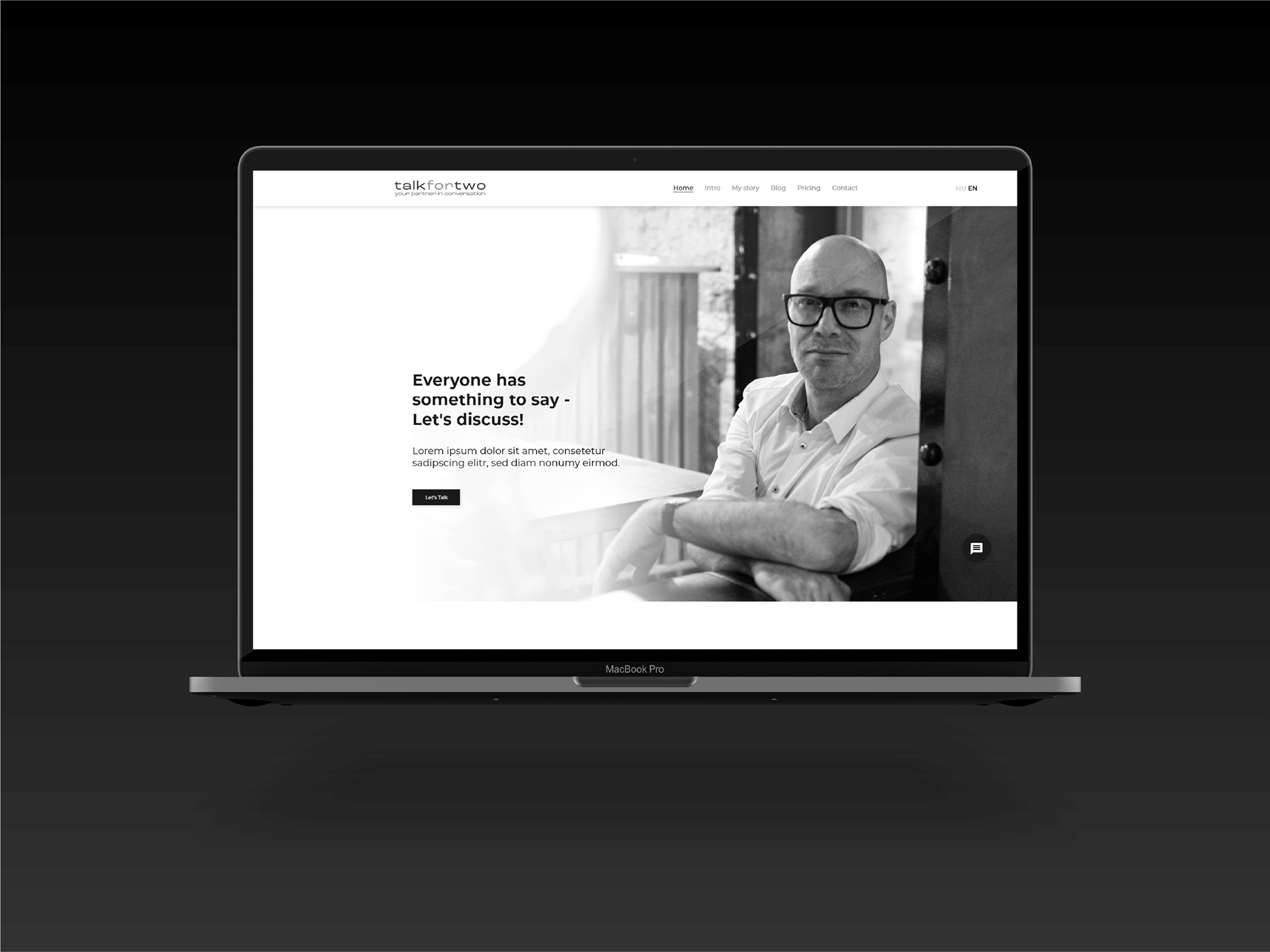
Landingpage with the focus on my father's persona
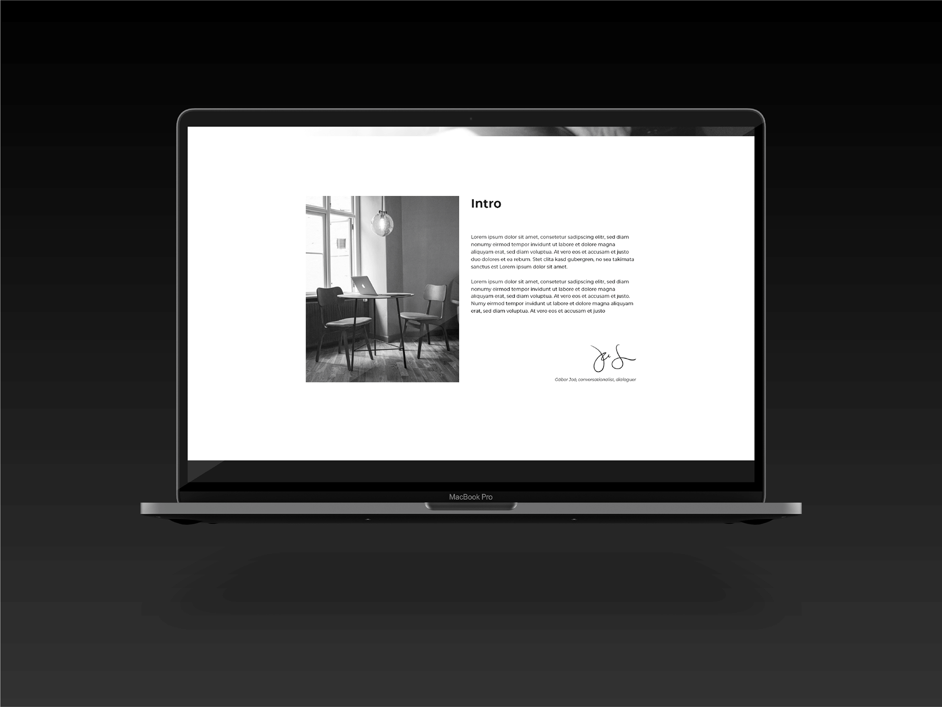
A short introduction
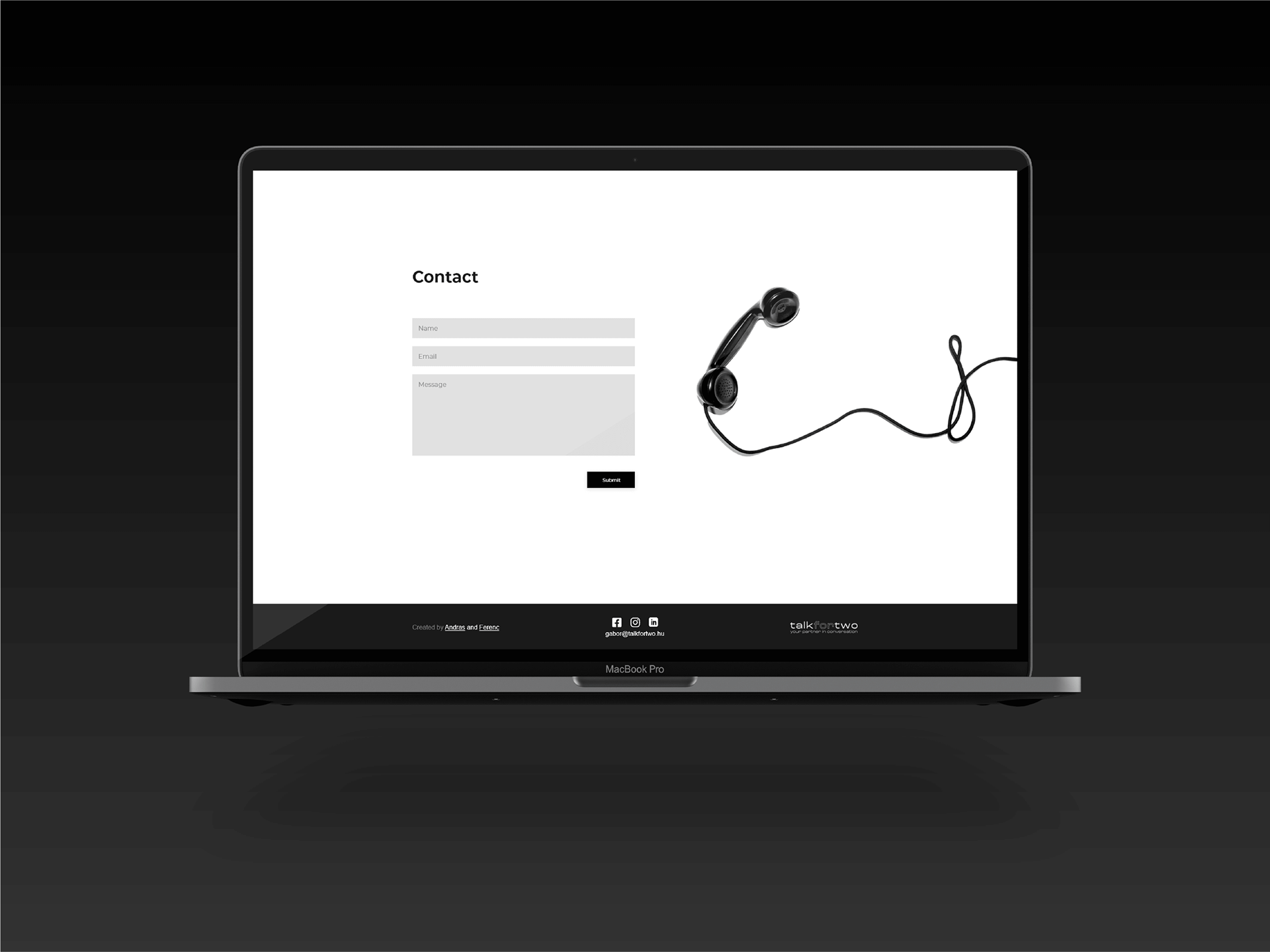
Contact page with a minimalistic design
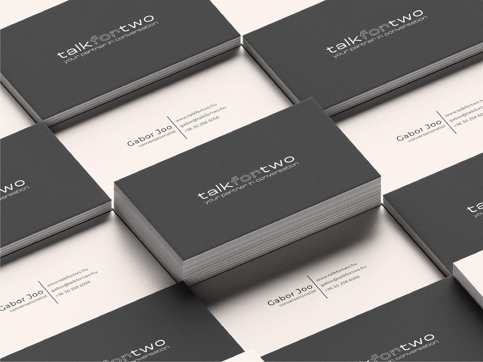
Sleek and elegant business cards, promoting his business
We meticulously crafted each element of the design to ensure that it met our core objectives, while still remaining aesthetically pleasing and true to the minimalistic theme. The result was a visual identity and website design that perfectly encapsulated my father's business, appealing to both his target audience and his own personal taste.
Try out the interactive prototype!
DISCLAIMER: The website is temporarily offline and cannot be visited.


