As a graphic designer at InterCollege, I was given the important task of giving an identity to the student book "N.E.R.D.S.". My role was to create a visually appealing layout that was both informative and exciting for students while staying true to the theme of science.
NERDS cover design. Feels almost like a NASA manual.
The name and concept of the book, combined with the inspiration from the NASA logo, led me to choose a design direction that was heavily influenced by science and technology. I was particularly inspired by the user interfaces of science fiction video games, which led me to create a design language that incorporated sharp angles, a minimalistic black-and-white color palette, and bold, colorful images.
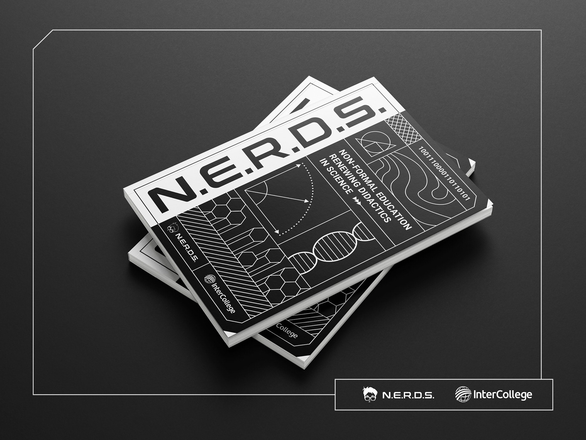
The cover of the book showcases examples of the major sciences
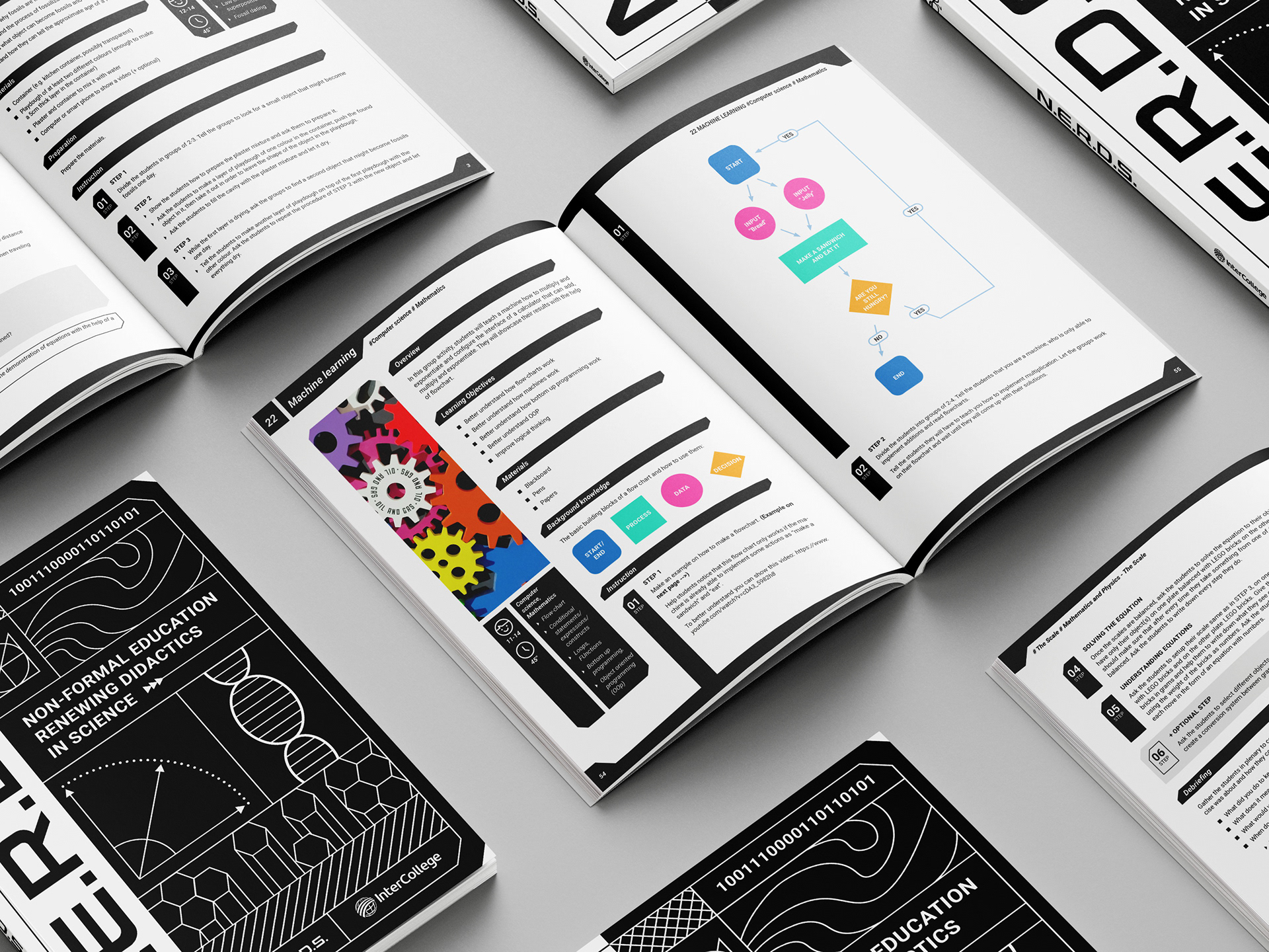
A touch of color in the midst of black and white design
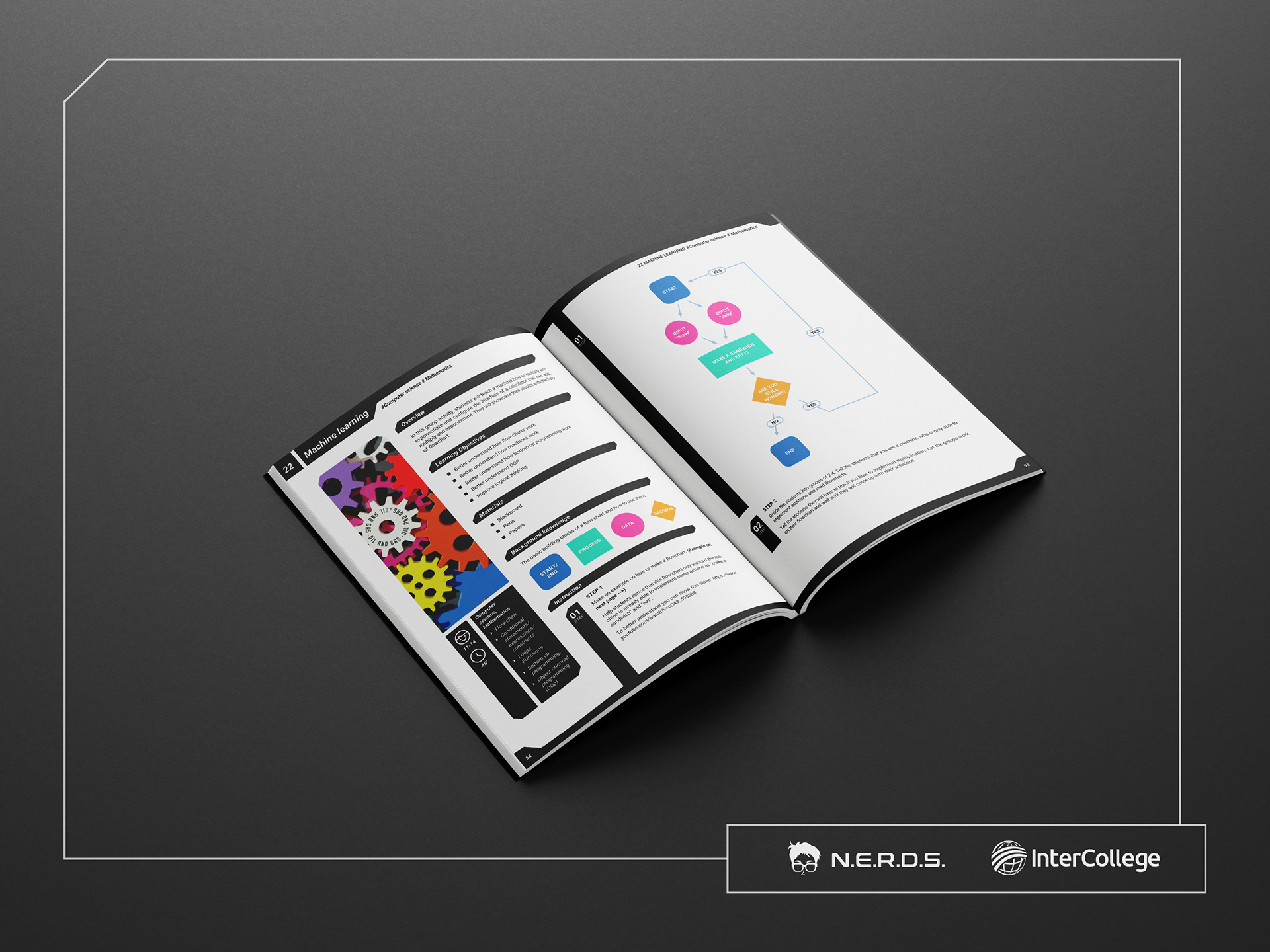
These activities were designed to educate children on science in a non conventional way
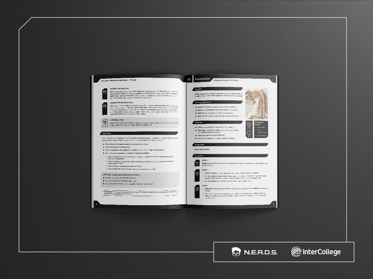
Simple yet engaging layout helps digesting the text heavy content
The end result was a sleek and elegant book that had a strong visual identity, capturing the essence of science and technology. The layout composition, combined with the design elements, gave the book a newspaper-like feel, making it both informative and engaging for students.

