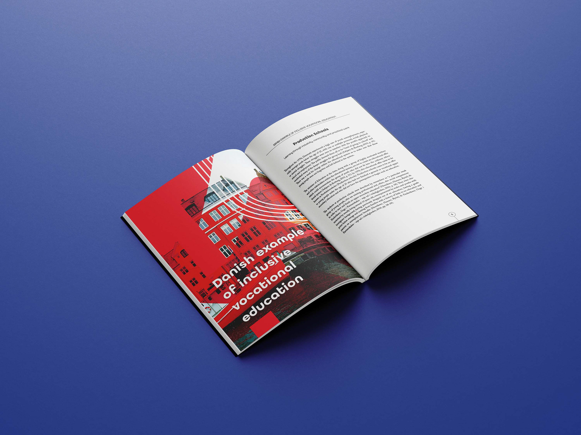
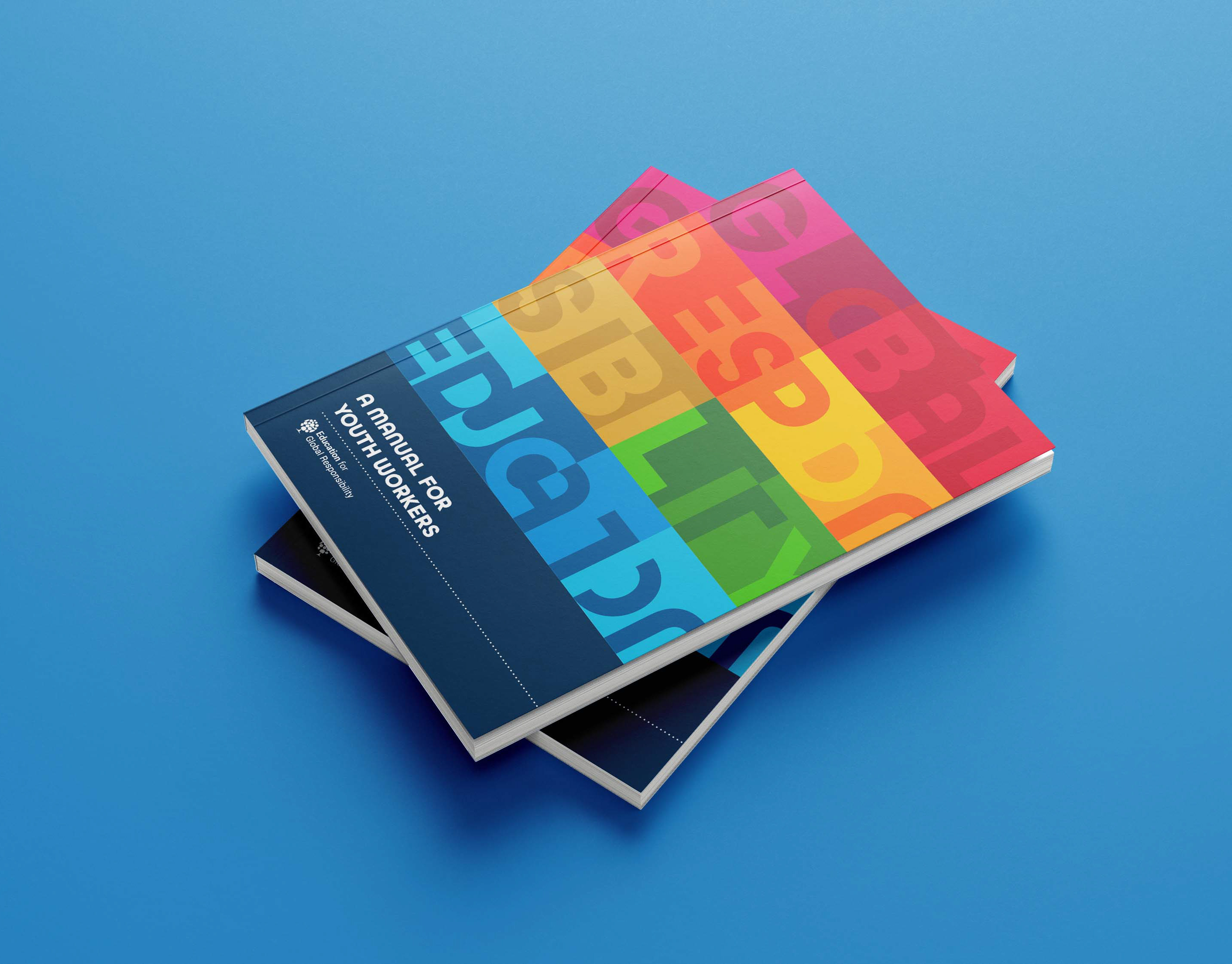
This comprehensive guidebook showcases a beautiful serif font that enhances the reading experience, providing a sense of sophistication and elegance. The divider pages were thoughtfully crafted to serve as visual cues, effectively separating the contents into distinct sections while making a bold statement. The overall layout, color scheme, and logo were meticulously designed by me, allowing for a unique and personalized touch to this publication. The result is a cohesive and beautifully presented booklet that was built from the ground up, reflecting my attention to detail and creativity.
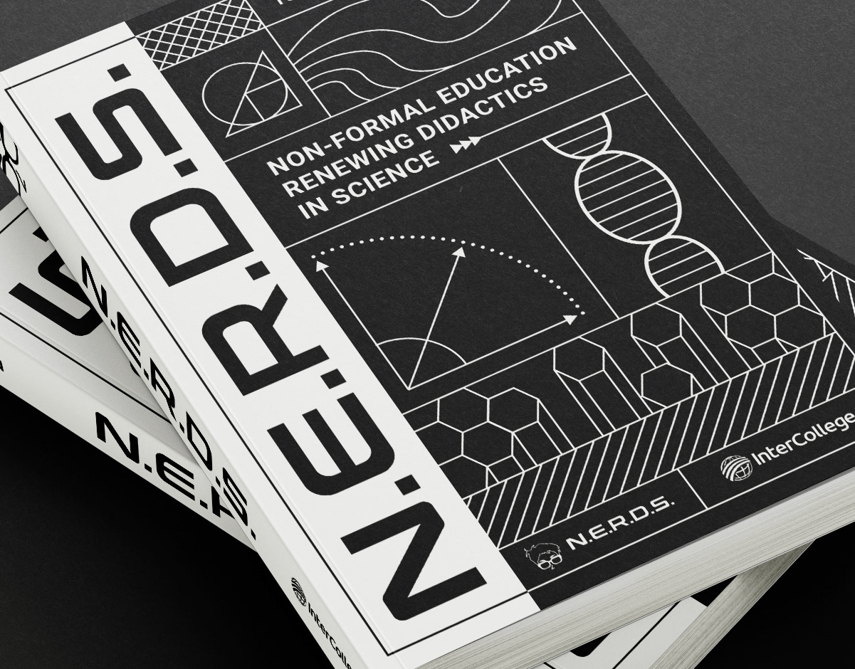
Cover of the book featuring the logo of the project
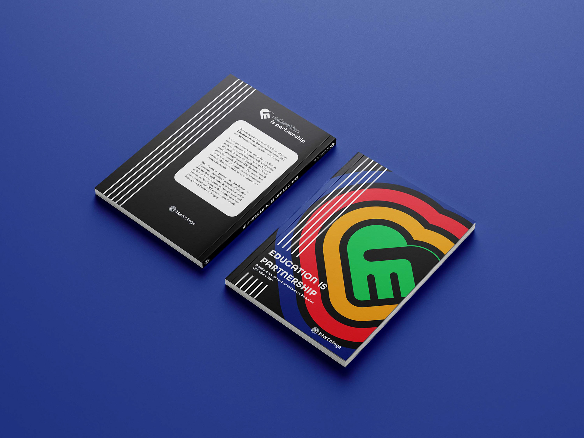
A very colorful yet simple cover design
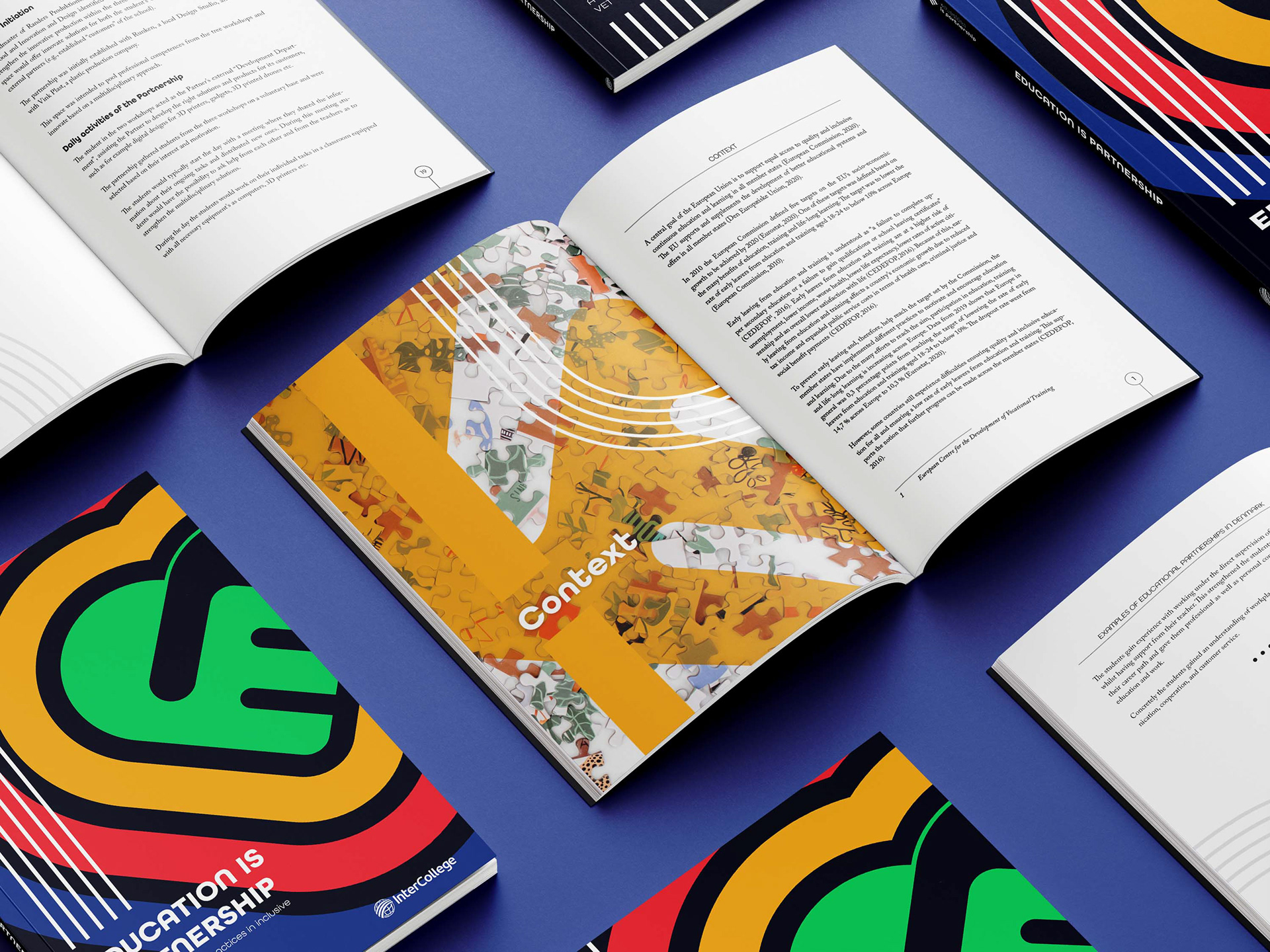
Content dividers stand out with their unique and bold design
